Jackson Rising
Background:
This text/image heavy
layout will ask you to utilise body copy, title, date, and location, heading,
sub heading, imagery, indexes, highlighted quotes. The amount of text allows
for the use of imagery and the type to serve as the main visual elements.
Brief:
You are to layout and design a 10-page
concertina folded brochure for a forth-coming exhibition titled ‘Jackson Rising’ at MoMA, New York. All
images, copy and branding are included. You have to create a visually
stimulating layout that showcases the artists’ imagery but does not sacrifice
important information in this process. The images and information must flow
harmoniously and offer a taste of what is to be expected during the exhibition.
Branding elements must be kept to
black and white. Images must be unaltered and in colour.
Considerations:
Headings, headlines, body copy,
grid, type, colour, image sizing, bleed, margins, flow, audience, narrative,
language, purpose, size, external print methods, preparing for print, stock, distribution.
Specifications:
Format: A5 x10 – Portrait – Concertina
spread (front and back).
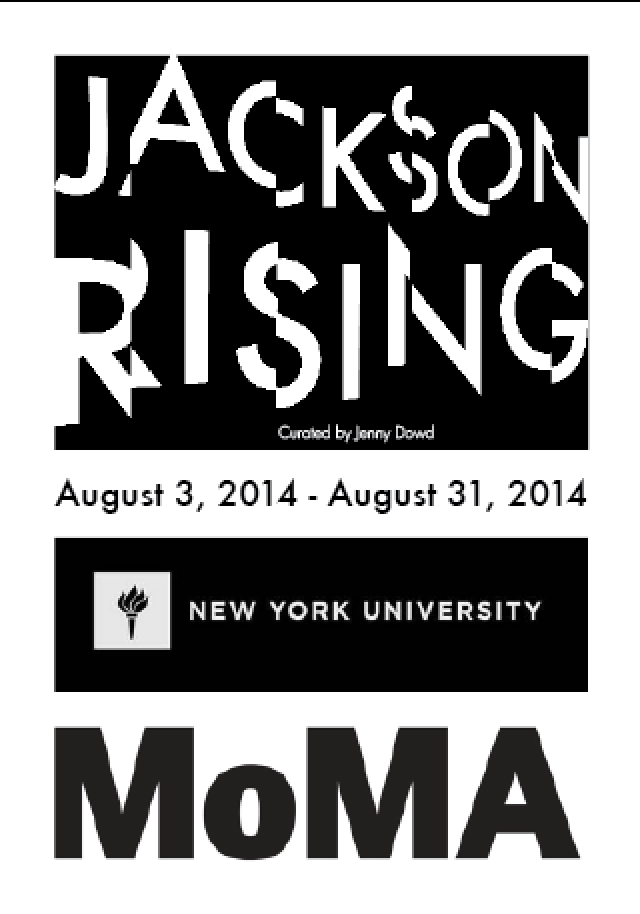
Title: Jackson Rising - Curated by Jenny Dowd
Dates: August
3, 2014 - August 31, 2014
Location: 11 W 53rd St, New York, NY
10019, United States
Introduction:
Four artists met at an artist residency at the
Ucross Foundation in 2013, now they come together to inhabit at MoMA, New York.
List of
artists:
Ruth Boerefijn
Lindsey Glover
Mayme Kratz
Jenny Dowd
Ruth
Boerefijn:
My process is experiential. I make visits beyond my
self: to Iceland, to the store where the fishermen buy their supplies, to the
library.

The feel of manuscripts, photographs and maps give my hands something to articulate when later, in my studio, they work knotting and looping lengths of fishing line. It loses form over time, and can be reshaped; it is resilient. The line is a symbol of connection, of reaching into the depths for nourishment.

The colored paper is cut from my own drawings from nature-imprinted with other narratives and perceptions-through which I punch holes as a way of forging through them to get to the act of new expression.

Text is also a material with a memory and a shape. I struggle to arrange words so they can articulate beyond history to character, story, felt experience, and new possibility.
The feel of manuscripts, photographs and maps give my hands something to articulate when later, in my studio, they work knotting and looping lengths of fishing line. It loses form over time, and can be reshaped; it is resilient. The line is a symbol of connection, of reaching into the depths for nourishment.
The colored paper is cut from my own drawings from nature-imprinted with other narratives and perceptions-through which I punch holes as a way of forging through them to get to the act of new expression.
Text is also a material with a memory and a shape. I struggle to arrange words so they can articulate beyond history to character, story, felt experience, and new possibility.
Lindsay
Glover:
Using multiple projections, Lindsey Glover
transforms the Loft into a space for the exploration between perception, memory
and experience. She collects photograph and video images that are later re-examined
to find parallels in context, all the while focusing on the capture and storage
of time.
Mayme
Kratz:
Mayme Kratz creates art from the natural life of
the desert that surrounds her Phoenix home and studio. Viewing collecting as a
way of archiving memory, she assembles a variety of natural forms—tangled
birds’ nests, feathers, bones, seeds, snakes, and cicada wings—and captures
them submerged in resin to create rhythmic, abstract sculptures and reliefs.
“My collected specimens celebrate the endless cycles of change and rebirth in
nature,” Kratz has said. In addition to these hanging and freestanding works
she has also created a variety of videos and installations, including an
interactive outdoor sculpture made of found tumbleweeds meant to disintegrate
over time.
Jenny
Dowd:
Jenny Dowd explores space and movement with a
series of steel and Egyptian Paste vessels. The boats hover, dive and flock
overhead while exploring the gallery in a playful dialogue.
Contacts:
Ruth
Boerefijn: www.ruthboerefijn.com
Lindsay
Glover: www.lindsey-glover.com
Mayme
Kratz: www.maymekratz.com/
Jenny
Dowd:
www.jennydowd.com
info@jacksonrising.com
www.jacksonrising.com
www.moma.org
Image:
Jackson Rising ident / MoMA logo / NYU logo
Multiple Artist imagery
(Use embedded InDesign file and follow grid.)
Save as PDF file.
Development

To keep continuity with the flyer I have kept the from page the same design.


I have used different weights of the font for hierarchy to separate the artists names from the information.


I have span the first artist across the remaining three pages on the front of the concertina because she's has the most body copy to display.

I have used the black line bleeding from the image to the artist name to make it clear that the information corresponds with the image.
Front


This artist didn't have much copy so I used one spread to layout the information. I have kept the column width the same and will do throughout. I decided the change the type the centrally aligned because I didn't think it looked right in the center with left align.


There was more copy for this artist so I have used two spreads to lay it out.


As this spans two spreads I have used the line to link it to the image as before.


I made the image much bigger on this spread because the amount of type was minimal.

The back page mimics the front but with the logos horizontal and larger for promotion.
Back

Front and back

Although this was a quick exercise it was fun to see how I could work out how to lay it out effectively in the given time. I imagine this would be whats its like in editorial design or generally working with a quick turnaround.
No comments:
Post a Comment