The Brief


Meeting1
-Collaborative work
Me and Roxxie meet up to brainstorm some ideas for each poster.

We made a list of words relating to each product to explore ideas. We are thinking of using the technique of quilling in the posters because we feel it best suits the style of the Body Shop and would appeal to the audience.

Next we stated to brainstorm ides for the campaign poster. We wanted to use a subject that is current and relevant at the moment. The strongest idea we had which were thinking of using is the topic 'Same Sex Relations' This is a massive talking point at the moments with the problems in Russia and from the past campaigns the body shop have done, we felt this is something they would be interested in promoting.

-Individual work
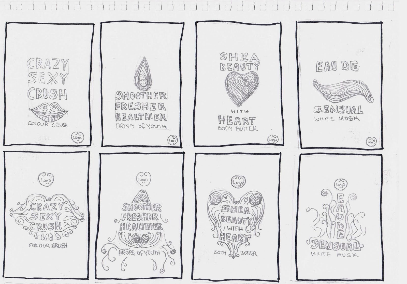
We have organised to meet up on the 18th, so in preparation I have done a few sketches of initial ideas for the product posters.

I wanted to use a strap-line on each of the posters so I made a quick mind map taking words from the product descriptions and from some of the feedback left by customers on the website. I will need to discuss these with Roxxie to see if we both agree if they are appropriate but either way the designs could still be used.
Colour Crush
-Crazy, Sexy, Crush
Body Butter
-Shea Beauty with Heart
White Musk
-Eau De Sensual
Drops of Youth
-Smoother, Fresher, Healthier
thumbnails:


Meeting2 / 18th Feb
-Collaborative work
Today we organised to meet up to decide on colour schemes and strap-lines and to get the quilling paper ordered so we have plenty of time to receive it and product the posters.
Colour Schemes:
For the colours schemes we have decided to use different shades of the colours of the products for association with the audience.
Drops of Youth

Colour Crush

Whit Musk

Body Butter


Qulling Paper Order:
5mm width

All together the quelling paper has cost £14 so we have split the cost equally so £7 each.
Strap-lines
We have decided to go ahead with the strap-lines below, These will feature on the product posters.
Colour Crush
-Crazy, Sexy, Crush
Body Butter
-Shea Beauty with Heart
White Musk
-Eau De Sensual
Drops of Youth
-Smoother, Fresher, Healthier
Fonts:
We have decided to use two main fonts:

This will be used for the template for the strap-lines using quilling.

We are going to use this font for the smaller type, this will be printed digitally.
Action plan
Start experimenting with Test pieces:
-Digital layouts for printing
-Typographic tests
-Qulling shape tests
-Gluing and scoring tests
For the 19th
We have arranged to meet on the 19th at 12pm to start experimenting with different quilling techniques.
-Individual work
Ater the meeting today we have decided to individually get some test pieces ready for experimenting with quilling.
Test1

Test1 will be typographical focusing mainly on the outline of the letterforms.
Test2

Test2 will try a different method with using pins to outline the letterforms and glueing the base on afterwards.
Test3

Test3 will try out filling in the letterforms with quilling and to see how it looks with the smaller text digitally printed.
Test4
Test4 will experiment with decoration around the letterforms leaving the inside open.
Test5

Test5 will be to experiment with using different quilling shapes for the detail.
Meeting3 / 19th Feb
-Collaborative work
Quilling Experiments1

Today me and Roxxie met up to experiment with quilling. I focused on creating the letterforms and Roxxie experimented with different quilling shapes and patterns.


First I tried to pin the outlines of the letterforms and wrap the paper round but the edges of the letterforms were rounded.

I decided to try a different technique by folding the edges and using the pins to mild the paper round the curved sections of the letters.

This worked much better however its very time consuming so we will need to factor this into our schedule.


I tried using different stock to see what worked best. I found the thicker water colour stock easier to work with and it held its structure much better.

Roxxie experimented with shapes and decoration within the shapes.


We are meeting up again tomorrow to continue with experimentation and to general improve our quilling skills. We are going to swap roles tomorrow, so I will try some shapes and decoration and Roxxie will try out the typography. This will aid us when we come to produce the final pieces as we will be able to work on two posters each to save time.

Overall the day has been really productive and has given us a good indication of how much time we will need to produce the final outcomes.
Meeting4 / 20th Feb
-Collaborative work
Quilling Experiments2

Following on from yesterday me and Roxxie continued to experiment with quilling to improve our crafting skills.

I was experimenting with filling in the letterforms with decoration. Although it was time consuming and required a lot of patience I was quite pleased with the way they turned out.

I wanted to see what the same effect would look like in reverse so I made a quick sample. I think it looks ok but the method below that Roxxie tested looks much better.

At the moment this is the style we are thinking of going a head with for the final pieces but we will see what feedback we get from the next crit before we make any final decisions.

Also, today the quilling paper arrived so as soon as we get some feedback we will be ready to finalise the designs and start making the posters. We also discussed stock choices for the background. We are thinking of using the same colours as the products and quilling paper so when we next meet we will look at ordering some sample pieces.
Overall the progress is coming along nicely and we have stuck to the original time plan so we are in a good position with this brief so far.
Meeting5 / 4th March
-Collaborative work
Today me and Roxxie met up to try some experiments with the background that was discussed in the last the crit. We wanted to try some textures for each poster to use in conjunction with the quilling typography.

The first method we tried was to crush up water colour pencils and sprinkle them onto paper with spray mount on. This didn't work to well so we decided to leave it.
Fabric Die

We tried wetting the paper and sprinkling fabric die on top. This spread out much more with the water and created different shades and hues of colour.
Ink

Using the same method we dropped ink onto the paper. This method was less controlled and looked really messy so I don't think we could use this for the designs.
Brusho Paint


Next we tried using brusho paint by wetting the paper and sprinkling it on top. This created some nice effects but didn't separate the shades of red very well.


Here we tried it with two colours. They mixed together well to form some nice patterns.


We tried the green brusho which would be used for the drops of youth product.

We made a quick mock of the poster to see what it would look like. I personally feel the background is too much with the quilling and it will detract attention from the type. I think the space around the letterforms needs to be negative to allow impact with the quilling. However, Roxxie is going to do some more experiments with the brusho using different techniques to see if she can make it more subtle.
Once she has done this I am going to digitise the designs and get the poster bases ready for quilling. We have two weeks and a few days till the deadline so we have planned to get the posters finished by the end of the week which will leave us a week to sort out the campaign poster and other channels.
Background Images
(Roxxies Work)


These are the four background images that Roxxie has been working on. I think they have come out really well and and she has designed them perfectly to allow space for the quilling type that will be left aligned.

She has also made this design that we can use for the campaign poster. I think it works really well because it uses the colours of the gay pride campaign and works as a set with the others.
-Individual Work

In preparation for the background content, I have gridded out the type to make sure they are consistent across the four posters.

I cropped the images that Roxxie sent me in photoshop and Placed them into illustrator.

I wanted to see what they would look like aligned left. I personally think they work better on the right because the type will be be quilled so it needs space to breath.

All that was left to do was to turn the type into outlines at the smallest pt size. This is needed so we know where to quill the letterforms.
Final Poster Bases


After I have spoke to Roxxie to see if she is also happy with them then will are ready to print them and start quilling. Will be photographing the quilled posters and adding the rest of the content in digitally.
Meeting6 / 5th March
-Collaborative work

Today me and Roxxie met up to print the designs. We decided to print them on matt stock to avoid glare when photographing the final pieces. We have mounted each poster onto mount board so we use the pins to aid in constructing the letterforms. The posters are ready for quilling which we are starting tomorrow.
Individual Work
We have decided to produce two posters each to divid the workload fairly. Im doing the Body butter and Lipstick product posters.


We are both really pleased with how the posters have turned out. Although we created the posters separately I think they work really well together as a set.
Now we have finished the posters we are going to photograph them. We have booked a slot in photography so we can get some good photos of our work.
Photoshoot
We got some pictures of the posters. We have taken some form above for the main entires on the brief and some close ups to put on the design boards to support the designs. Although we are happy with the pictures we will need to touch them up in photoshop as you can see the glue around the letterforms. We are going to divid the workload as before and photoshop the posters we worked on to save time.Close Up Images
The close up shots all need some work doing to make them better. The glue can be seen around the letterforms so I am going to edit them to make it cleaner.

To edit the photos I have duplicated the original image twice.

On the first image I have applied a surface filter to smooth out the blemishes.

On the second image I applied a layer mask.

On the layer mask i used the brush tool with soft pressure and painted out the glue marks to reveal the blurred layer underneath. This worked for most of the blemishes but for some of the more noticeable ones I had to experiment with the spot healing brush.
Edited photos


Edited Posters


Individual Work / 17th March
Today me and Roxxie had planned to meet up but she was ill so we agreed she would work from home and I would finish off the product posters.


Roxxie had edited her two posters but she was unsure on how to remove the glue from around the letterforms so I finished them off using the same method as before.

One I had fished editing the photos I moved over to illustrator and gridded the poster so the type was in the same place.

I inserted the logo, body copy and product name.


I have been in contact with Roxxie and we decided that the logo would work better in white with the colour background. She suggested to increase the leading of the body copy as well, this made it easier to read.

Roxxie also mentioned that the white musk type looked isolated compared to the others so she suggested to add perfume underneath so its similar to the colour crush poster.
The product type still needs work on the composition but the posters are nearly there now. We are meeting up tomorrow to finalise the posters and start the other channel section of the brief.
Meeting7 / 18th March
-Collaborative work
It took a bit of adjustment of the layout of the product names but we are both happy with the final posters. We will now need to concentrate on the other channel deliverable to finish of the project.
Other Channel

For the other channels we have decided to focus on social media. Our idea is a competition that uses Facebook and instagram as the main platforms. The audience has to film themselves performing a good deed and upload it onto the Facebook or instagram page for the chance to win a rewards cards and money off products in-store.
Me and Roxxie worked along side each other, she worked on the cover photo for the Facebook page and she is going to create the Instagram mock-up. I am going to create the Facebook home page, competition page and the twitter page.
Homepage

The competition thumbnail leads on to the competition page when selected.
Competition Page

On the competition page the audience will scroll down to the bottom section where they can submit the video.
Twitter page

The twitter page will be used to promote the competition and direct the audience to the Facebook AND Instagram page.
Context
To show how the designs work in context we are mocking them up on screen. This will help to illustrate the idea on the final design boards.
Facebook Homepage


I wanted to make it clear how to get to the competition page so magnified the competition thumbnail.

Competition page
Because the competition page will need to scroll down, Roxxie suggested to make a sequence to illustrate this so I have mocked up each stage to make this clear.


Final Layout

To make it even more clear I tried to lay it out in the most logical order to illustrate the steps of use.
Meeting8 / 19th March
-Collaborative work
We had to submit the brief before five today so we were getting all the files ready and putting together the design boards.
DNAD
submission

Everything went ok with submitting the work, Ive really enjoyed working on this brief and working in collaborative.
No comments:
Post a Comment