They will need a range of designs to promote the events through print and digital media.
Background:
The event takes place monthly with different artists featuring alongside resident DJ's at the Liquor venue.
Deliverables:
Print:
Poster
Flyer
Promotional C.D.
Digital:
Facebook Cover Photo
Facebook Profile Page
Ticket Banner
Event1

As the promotion will be for the first event night I am going to keep the colour scheme the same for association with the branding.

Colour Scheme

The featuring artist is TomBull so his logo will need to be a focal point. There are no guidelines for the use of the logo so I am free to do what I want with it.
Artist (dj) Logo
Poster Development

I made a grid to layout the information, it breaks the page into three sections, one for the main logo, the Artist logo and the body copy.

The image above is the logo of the venue so I am going to mimic this with the Jacked logo. This with the original colours form the branding will create association for the audience.

To do this I duplicated the logo, with the bottom logo I used a brush stroke with a white fill, the top layer, I minimised the inner stroke with a black fill for highlights.


I wanted to use the same colours as before so I used a present brush in illustrator and deleted sections to make a custom pattern to frame the poster.


I edited the original TomBull logo to better suit the design.I outlined the path and added an outer shadow to create some depth. I think this works better than having the inside filled white, it reminds me of a neon sign which suites the event.
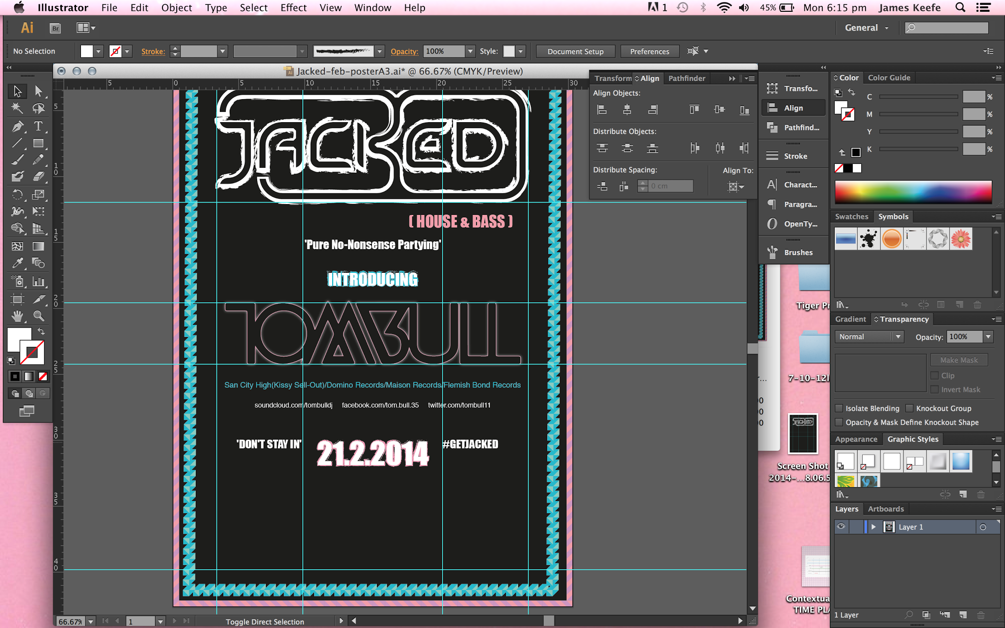

It didn't take long to add in the rest of the content experimenting with layout as I went along. I wanted to keep to the grid as much as I could for consistency still keeping the the focus on the main logo and artist name.

Event Poster:

Flyer Development
Now I have the content designed for the poster I should be able to re-tweak the elements to make the flyer. I want it to work as a set with the poster but also have its own identity so it can be seen as a collectable by the audience, something to stick on your wall.

The leaflet will be double sided so I want the two logos to be the focal point. The top section of the grid will house the logos for consistency.


I have kept the main information on the back of the flyer to allow the front to have maximum impact. The tag-line is 'Don't Stay In #GetJacked' so I wanted to give this more importance on the flyer.
Event Flyer: Front/Back:


Promotional C.D:

The client has also asked for a C.D design for a promo mix to further promote the night. The C.D will be in plastic sleeves so I used the white and red type around the edge of the cd to make it stand out. I have kept the content minimal as they will be handed out with the flyers so it doesn't need all the content as the poster or flyer.
Social Media:
Facebook Cover Photo:
To work alongside the event promotion I thought it would be a good idea to make a promotional banner for the resident DJ's to use on their personal Facebook page. This will help to promote the event to the local audience as the residents are based in Lincoln.

SoundCloud Cover Image:

The promotional C.D is available digitally so the client asked me to design a cover image for the resident DJ's sound cloud page.
Event2

The featuring artist for this event is Rich Pinder, below is the artists logo that will need to be to the focal point of the poster.

Artist (dj) Logo

I want this poster to look gritty and textured so I have changed the djs logo in photoshop by applying a threshold filter to change the appearance to solid black and white.


The last poster was vector based and clean cut so I wanted to create something different for this poster. I have used two textured images layered up with different blending modes to create a rough surface that will suite the logo better than a flat surface.

Next I made a simple grid that leaves the middle section open for the Dj logo. Because of the shape of the logo it will be more dominant than the last poster making it the focal point.


This time I have kept the Jacked logo the same as the original, the only difference is the drop shadow and the house and bass tag-line, I wanted the tagline to communicate the volume of the bass to reflect the baselines of the music.

I changed the blending mode on the djs logo to allow the texture of the background to come through. I also overlaid a texture to give to make it extrude more with a violet tint underneath to match the strap-line colour of the main logo.


The rest of the information apart from the date is the same as the last poster so I only needed to experiment with colour to create hierarchy.

Event Poster:

Promotional C.D:
To keep costs down, this time the client decided to use the promotional cd instead of having a flyer as well.

This meant I had to include more information this time but I still kept the same layout as before for consistency.
Event3

Cover Photo Development

The grid for design for the body copy to be placed on the right with the logo filling the centre as the event will only feature the Jacked resident djs so it needs to be the focal point.

The event uses funktionOne sound systems that are iconic so I have taken inspiration from the spreaker cones by applying an extrude and bevel filter to the logo. I have extended the extrude depth and changed the bevel to create a rippling effect to represent sound waves.

Behind the logo I have used a royalty free image of a DNA strand to communicate the idea of 'In the beginning there was...'
I have lowered the opacity so the the body copy will be readable and legible when placed on top.

I have used a similar purple as the last poster, I want the poster to progress each time to suit the event but still keeping connections with the previous poster so they all work as set.
Social Media/Cover Photo:

Because of cost the client will only need this design doing for the event as the easter event is the main focus.
Event4

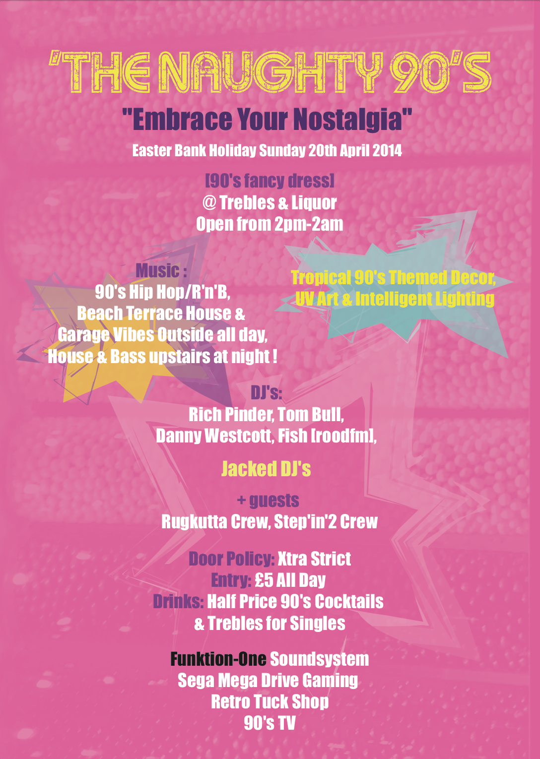
The first things that come to mind when thinking about 90's themes are bright garish colours with retro fonts. I want the designs to take on a kitsch feel to them to reflect to the theme.
Poster Development

Poster Grid

The client mentioned making the logo 90s themed so I have used the same filter as before but with a lower extrude amount and no bevel. When looking for inspiration, blue and pink were re-accuring colours so I have decided to use these as the base colours.


I wanted the background to have some texture so I have used an image I took of the MnM point of sale in London. I changed the blending mode to darken to allow the colours to show through. I have divided the page into top and bottom with the colours, the top will be for the logo and heading and the bottom the information.

For the event heading I am using a free font called 'My Girl is Retro' because I want it to look worn to add to the retro theme.

I have added a drop shadow to the 90's section for depth against the explosion vector that I create using a grunge brush.

I have used similar explosion vectors to frame the details with the most important information centred under the heading.

Event Poster:

Flyer Development

I will use the same principles for the flyer as before, impact on the front and information on the back.

I have re-arranged the logo and heeding to better fir the format. I have made the heading all on the same line for the flyer so I can utilise the bottom for impact.

One of my memories of the 90's is the arcade game 'Street Fighter' I want to use the gif above as an illustration to fill the bottom section of the flyer.
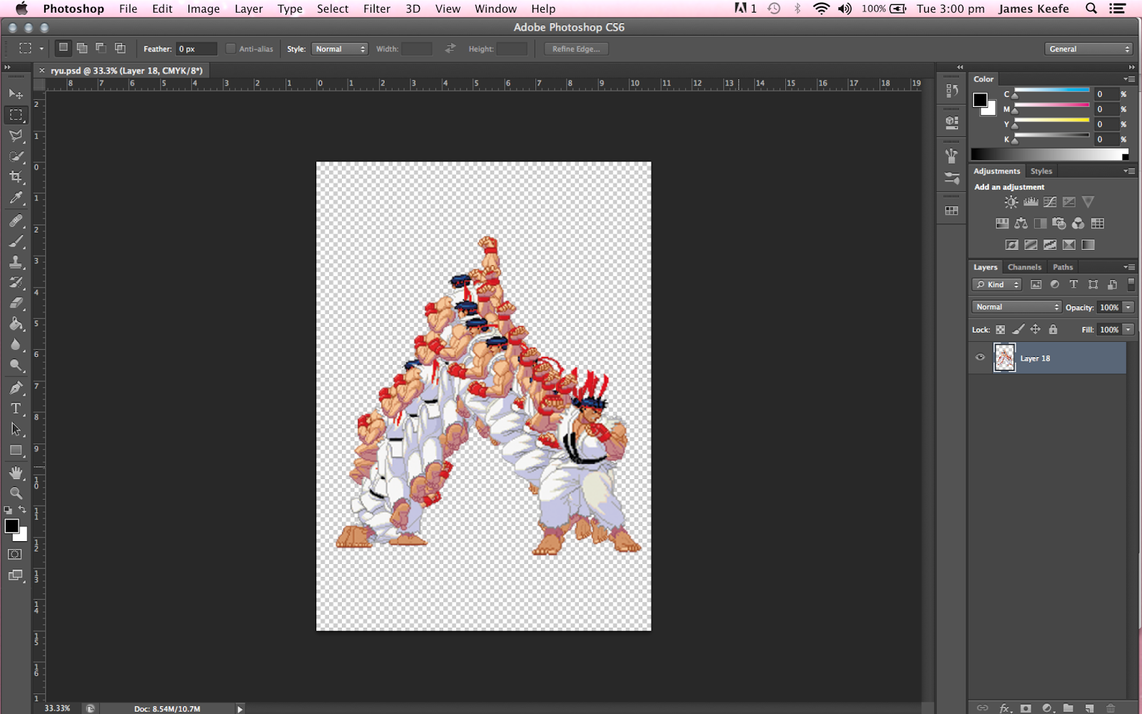
I opened the gif in Photoshop and moved each layer to replicate the movement of the gif.

To finish off the flyer I painted some brush stokes to further highlight the notion of movement. I tried to make the illustration so it leads the eye to the heading.
Event Flyer: Front/Back:

Social Media Development

I have made the logo a lot smaller for the social media because the audience will already be familiar will the brand so the heading has more importance.


I have found another gif similar to the one I used with the flyer. I want to create the same style of illustration but with the movement towards the right hand side of the image to utilise the space.


Social Media:
Cover Image


Ticket Bannor

Event Banner

Promotional Image

No comments:
Post a Comment