Menu


Before I printed the menu properly I wanted to make a mock up to make sure I had the pages in order.


I printed them onto watercolour stock. The stock didn't handle the amount of ink too well and the type on the front bled so I decided to re print it on satin.


I printed the inner pages onto the water-colour pages as well, this took much better to the ink so I am going to keep these because I like the contrast of stocks.
I tried to cut out the cover but because its satin stock it cracked when I folded it and it look really bad so I have decided to re-print on mat paper to avoid this.


The mat paper worked much better and I am now happy with the result.


The inside pages are printed onto water colour stock, this worked much better than the cover because it uses less ink. I am going to use this for the final piece.

Once I had cut all the pages out I bound them with a side stitch bind.
Stickers
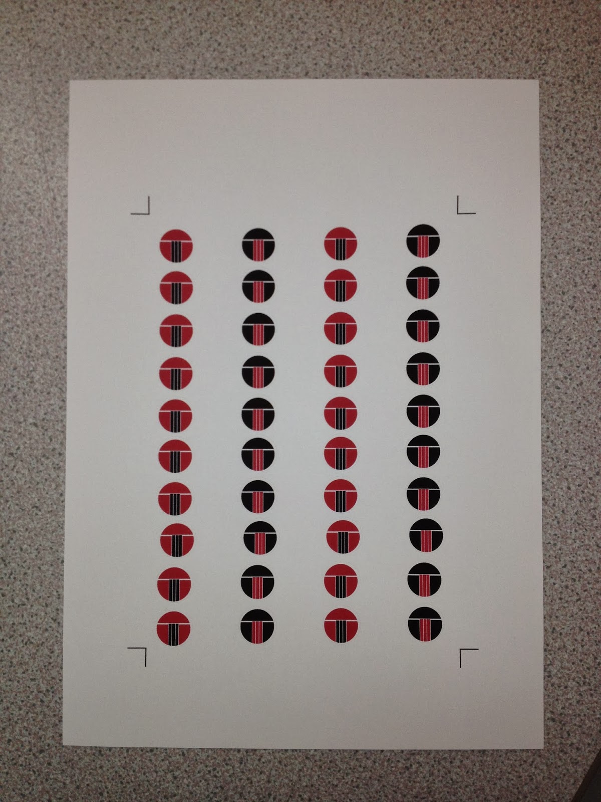
I wanted to apply the logo to the plates and bowls...so I printed onto white sticker paper. I kept the logo the same size as the menu to keep continuity.
Chopstick Holder/Menu

I gad the same problem with the stock for chopstick prints so I am going to re-print them.

I tried a test print on some lighter stock for the chopstick packaging. This works much better as it will fold better. I am going to get them digitally printed so the colours are brighter.

This stock was a much better option as it allowed me to fold the section easier. The only problem I had was getting them stick down because of the width of the chopsticks. I used some double sided tape for extra security.

I decided to use the keep the chopstick holders that I printed onto the water colour because the weight of the stock was needed to keep the structure to support the chopsticks.
Coasters


I also printed the coasters onto water colour because the texture of the stock is similar a bar coaster.
Business Cards


I decided to print the business cards on satin stock for a high quality finish. I spray mounted them onto watercolour stock then glued the front and back together for thickness.
Flyer


I printed the flyer on mat stock, I liked the charcoal finish because I think it works well with the darker black of the image. The flyer is double sided with the pattern from the inside of the menu on the back for continuity.
Outside Menu

I used satin stock for the outside menu for legibility and readability purposes. I mounted it onto black mount board to get a flat surface.

The production side of my printed material is now complete so I am now ready to photograph.
Tableware

I had to spray the Sake bottle, sauce dish and spoon black to fit with the colour scheme. I used satin spray paint to get a shinny finish.


To finish the tableware, I add the stickers I made to different areas. I used a different colour way sticker for the sake bottle and mirrored the two sticker colours on the outside and inside of the bowl. Im pleased with the result , however I had to cut round the stickers by hand because the printer cut them uneven. This meant the white trim around the circle is a little bit uneven.
-Dinner Mat

I am going to make a table mat with the bamboo mats. The colour of the wood was quite bright so I soaked them in coffee and tea to try and dull the colour.

To finish the mat I sowed black material to the underneath and made a trim round the edge.
-Napkins

The napkins are made from the same material as the table mat. I used red thread to trim the edges of the black napkin and the opposite for the red napkin.
No comments:
Post a Comment