Develop a new brand for USB chargers for phones and pads/tablets.
I currently have a range that I sell in AU called the PowerFlo brand but I need to develop another brand for some different customers (See jpegs of current range attached).
I want this to look so much better! And am happy to use special inks and UV to really bring the packaging alive.
Concept
The brand will be:
JuiceIT
Juice - fruit juice but it also means to put fuel in a car or charge a phone.
IT – Information Technology but also it mean to put juice (power in it).
We will need a logo developing for all the packaging and brand.
With regard to the graphics I was thinking of something very colourful like the PowerFlo range (which I am sending you also now) but much, much better!

I think we could use fruits and juice in vibrant colours against which the products can be placed.
I think the colours we can use are below: and if you can come up with fresh dripping juice and other vibrant luminous colours it could look great:
I think the colours we can use are below: and if you can come up with fresh dripping juice and other vibrant luminous colours it could look great:


and if you can come up with fresh dripping juice something like the below it could look great:


Perhaps you can start on some visual ideas/style guides and we can go from there.
We would use different colours to designate different categories of product such as:
Colour 1 – In Car USB Chargers
Colour 2 – Mains Chargers
Colour 3 – USB Battery Packs to Charge a Phone or Pad
Colour 4 – USB Cables
Colour 5 – Earphones
Let me know if you want a crack at this and what is your likely timescale.
If I go ahead with your concepts/ideas I will pay you a reasonable fee – to be agreed!
Robert H. Smith
Managing Director
Managing Director

-Presentation Boards
Now I have a brief to work to and I have done some research I feel I am ready to start brainstorming ideas.
Words that come to mind
JuiceIT:
- Fruit
-Dripping
-Splash
-Segments
-Peel
-Vibrant
-Refreshing
-Power
-Energy
-Charge
-Fuel
Initial Sketches
I started by sketching some ideas for the logo. I want to include aspects of fruit and charging up.

Font:
Haettenschweiler


I narrowed the variations down to the four above. I think they work much better than the others in communicating the concept and product.

After some reflection and conformation from my peers I have decided to use this design for the final logo. The shape refers to fruit and the segments have a decline in tint to represent the function of the products, charging the device.
Colour Scheme
Now I have the final logo design I need to decide on a colour scheme. I am going to use pantone swatches for the colours so the design will be consistent when printed.
PANTONE Formula Guide / solid coated

PANTONE 116 C
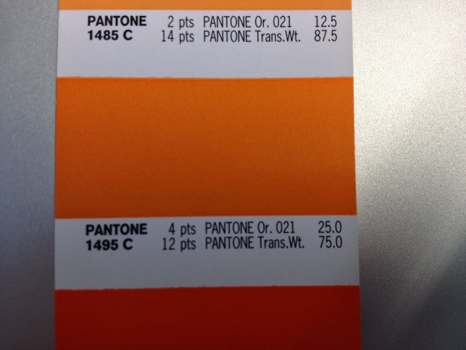
PANTONE 1495 C

PANTONE 1787 C

PANTONE 375 C

PANTONE 265 C
I have chosen to use spot colours for cost efficiency.
ColourWays:


I am going to suggest to use the same colours for the packaging so I wanted to see which colours worked best together.

Once I had the colours right I wanted to see what the logos would look like on top of the base colours.
Final Design


I chose to use this logo for the final design because I feel it works best with the colours. The colour in the logo works to create hierarchy with the type.

The client stated he was happy to use U.V varnishes so I am going to propose that the coloured section of the logo to be varnished. I think this will make the logo stand out and add quality to the print.
Pitch Boards
The client got back to me and they have decided to use my logo design for the brand. They have asked me to have ago at some packaging for a range of products.
Packaging Design
Brief:


The client has a range of products with different categories. I have been asked to colour co-ordinate the range and create a packaging concept for one of the categories. If they like the design then I will be need to design the packaging for the rest of the range.

The client sent me some PANTONE swatches that they liked for the categories. I am thinking of using the M series as they are almost fluro inks that will stand out the most.
Original Packaging

I am going to use the usb mains charger for the packaging concept. Above is the old packaging the client was using, I think it looks pretty dated and dull so I will need to create something fresh and eye-catching.

Front Cover Development


I started off with some variations using the fruit segment as the main focus of the design. I kept the designs above more digital looking as I thought it reflected the product.


I have selected the designs above to send to the client as I feel they are the strongest. I have had a few problems with the pantone colours that the client specified. I had to speak to the tech guess at college to get some advice as the colours swatches weren't available in illustrator.
I found out that the M series of swatches aren't available in newer versions of Adobe software so I had to import the colour swatches form Illustrator CS3. This was a good learning curve for me as the colours need to be correct for consistency when printed.

I changed the front sleeve design from the original by simplifying it and making custom icons to make it easy to understand for the consumer.

I incorporated the fruit symbol from the logo to communicate the amp value of the product.
Back

I have stripped back the content on the back to make as simple as possible for the consumer to select the right product. The original was cluttered and a bit confusing so I have aligned the information left in a logical order for clarity.
Packaging Concept Pitch1
.
The client asked for a parent logo so I included a logo with all the colours for each category within the fruit segment.
The feedback I received from the client was the other section colour needs changing because its too similar to the audio section. Also, they mentioned that liked the larger logo on the variations page but with the design of concept2. They have asked me to try it with the fruit segment at the top with the juice dripping down.
New Concept1

Packaging Concept Pitch2
.Amended Concept:
the feedback I received was the colours appeared dull and they wanted them to be brighter. I explained to them that the swatches meant it would print the same as the colours they had picked but I don't think they understood that it will never be a true representation of the colours when printed from a conventional printer because the colours are from the solid Pantone swatches.
Also they said they wanted the fruit to look more realistic and to really get across the concept of fresh fruit and dripping juice so they I will have to re-think the design.
New Concept2
The client wanted a more realistic looking fruit so they have supplied me with a stock vector image to use in the design. I did have a go at creating my own but my knowledge in illustrator isn't good enough yet.


To get round the issues with colour I chose two new swatches, one light and the other darker to try and get the vibrant shades they are looking for.


I found it really hard to try and create dripping juice in illustrator so I had to use grunge brushes to try replicate a splashing liquid.
After sending the new designs to the client they have decided to work with the designer they usually use due to location and time constraint as they have a deadline to meet that will be difficult for me to keep to as they are based in Australia and every step takes longer than usual.
However, they are still going to use my logo and have asked if its ok if they use the work I have already done to incorporate into the new packaging.
This has worked out better for me really as I have a lot of other things I need to work on and this was taking up most of my time. It was a good learning curve for me though as its most corporate and professional job I have been involved in so far. I also learnt a few things about Pantone swatches which will be useful in the future.
No comments:
Post a Comment