In groups we had to create a concept for a fictional restaurant, hotel, or a bar within Leeds.
We had to choose three words from jar one and one from jar 2.
The words we picked were:
Jar 1 -
Hat
Calendar
Frame
Jar 2 -
Restaurant
We started by mind mapping each word to generate some ideas:

Our first idea was to create a tree house themed restaurant that served food that corresponded to the four seasons 'spring, summer, autumn and winter. After some discussion and bouncing ideas about we found the idea burnt out so we decided to revisit each mind map to re-think our options.

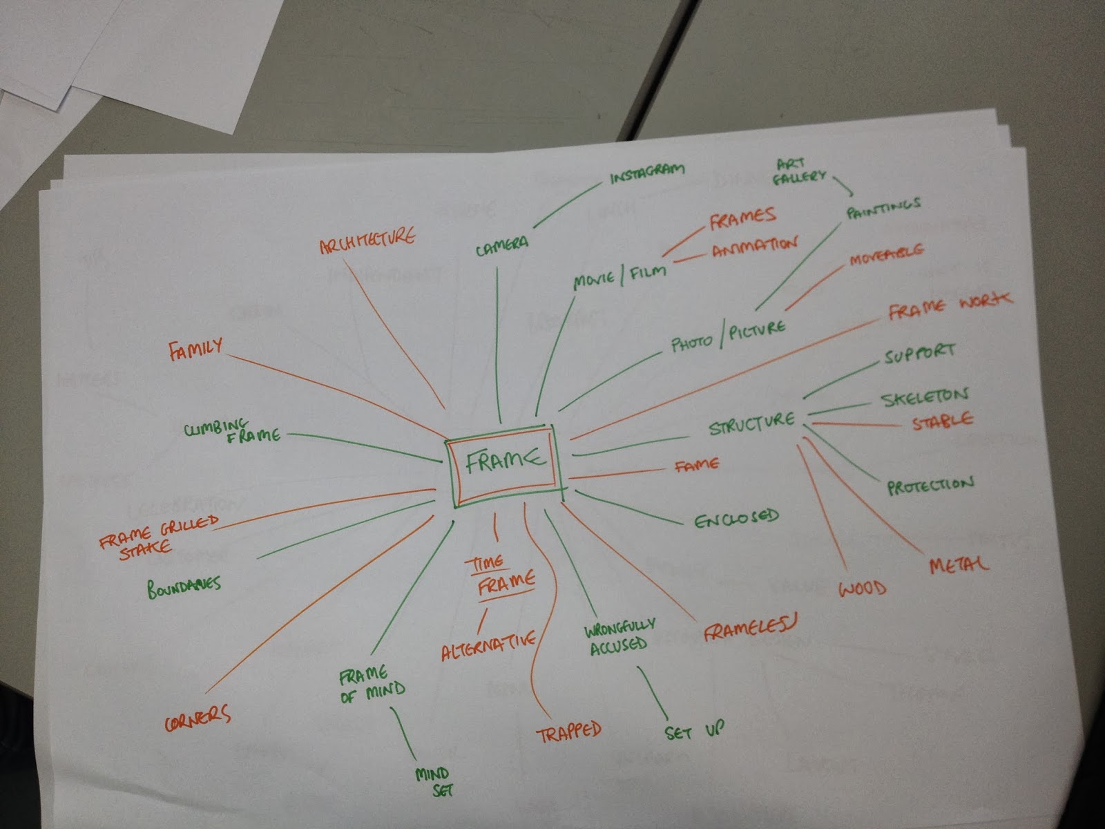
After revisiting 'Frame' we decided it was the most applicable and had the most scope to develop into a concept.

We mind mapped the word restaurant as well to gain a better understanding of what kind of restaurant we could propose.

We went from 'fame' to 'time frame' which lead onto the final concept of a restaurant located in Leeds train station that would be open at unconventional hours. The target audience are people commuting or local workers traveling at times that other restaurants are not open, apart from greasy takeaways. The restaurant would sell good quality, affordable food that comforts and satisfies.
We wanted to be specific with the details so we could get a better understanding of how to go about branding the restaurant.
Once we had all the details down and the concept was strong we started thinking about names for the restaurant. We found some of the names a bit too tacky which would not be in-keeping with the brand. After some research we came across the name Nox which is the Roman translation of NYX, the goddess of night which relates to the opening time of the restaurant.
Logo

We wanted the logo to be simple but elegant to reflect the quality of the brand. This also informed the colour scheme as the reds and blues of conventional fast food restaurants looked cheap so we decided on black and white, which also stems from the ideas of night time. The 'O' has two hidden meanings, if looked at from a vertical angle it read the number 10 which is the opening time of the restaurant, the 'O' represents the moon in the sky and night time.

We felt it was necessary to put a menu together to inform the branding.

We made some mock-ups so the audience could get a real feel for the brand.

I really enjoyed this task and enjoyed working with my group. We had some good discussions which helped us to come up with a well informed concept that considered all the details and target audience which is key to a successful concept. It really helped me to think about the thought process that goes into a concept and how it can add meaning to a design.
I feel this workshop has helped me gain a better understanding about thinking about target audiences which was one of the questions from my 'To Do' list.
No comments:
Post a Comment