

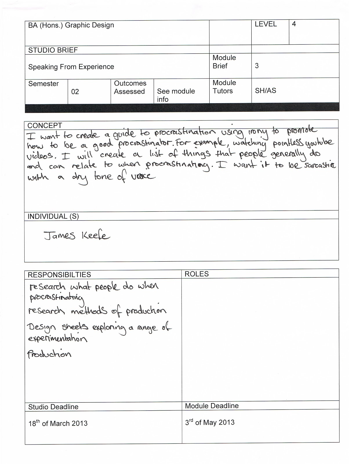
Concept
I intent to create a guide to procrastination using irony to suggest how to be good at it to highlight the things people do when procrastinating. I intent it to be informal and make the new students aware when they are distracted and act as deterrent to procrastination.
Method of Delivery
The format I want to display the content will be a poster that folds up in a challenging way to represent the idea of being distracted and procrastinating. I have chosen to create a poster because I think the new students could have it on their wall were they work to remind them of the un-productivity associated with procrastination and motivate them to keep focused.
Method of Production
I will create my poster digitally and in A2 scale. This will allow me to have more folds in the poster and i will be able to print double sided if needed. I want to design the poster in a minimal style using sans-serif fonts and a limited colour pallet of no more than three colours for maximum impact. I will print the poster with a matt finish on a light stock to allow me to fold the paper without it cracking.
Presentation Boards
- Concept
- Method of Delivery
- Method of Production
After my crit on friday it was suggested that I create a range of material instead of making one poster. From the research I conducted I have had some ideas:
- Poster
- Fold up booklet
- Sketch pad
- sticker set
- blog- design resources, games, tools to avoid procrastination
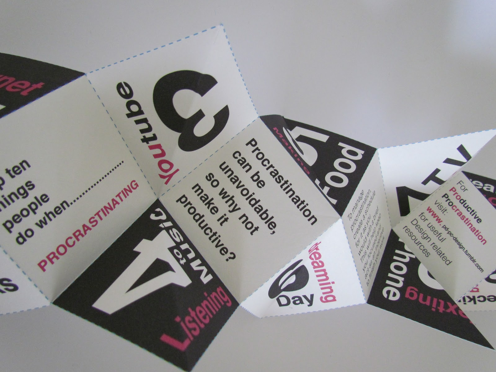
From the 29 responses to the survey I conducted for my primary research the top 10 ways that people procrastinate in order are:
- Internet
- Social Network
- Youtube
- Listening to music
- Making food
- Daydreaming
- T.V.
- Talking on the phone/ Texting
- Tea/Coffee Breaks
- Checking emails/ Cleaning
Development

From the first crit I had it was suggested that I make procrastination productive. This gave me the idea to create a logo to feature across my designs to create an identity. I decided to call it 'Productive Procrastination.'
Final Logo

I decided to use this design for my logo because I feel it's simple and has the strongest impact.
Blog
I have created a blog as well with a range of design related resources. It has links to design blogs that I have found useful throughout the year as well as some design themed games to improve your knowledge of colour and type.
http://pd-pc-design.tumblr.com

Promotional Material
As my concept has evolved I have decided to design a pack of material. I experimented with some different paper folding techniques to create a promotional product to direct the viewer to the blog.


This technique is called the windmill. It reveals three images when folded. I don't think this method is suitable for what I am wanted to achieve.
Shapeshifter


I tried another technique called 'shapeshifter', this is a more interesting way of delivering the design and reflects the idea of procrastination better.
Each stage:


The shapeshifter is a little promotional product thats aim is to direct them to the blog site.


I printed the shapeshifter and assembled it but the thickness of the stock affected the way it folded. Its really difficult to turn so I tried again and scored the stock before I folded it.

Once it was folded I repeated the process but once it was folded the structure was too weak and it fell apart. I was really disappointed and had to make the decision to discard it.
Booklet


Sticker Pack


I drew the stickers on graph paper so I could work out the dimensions. I also decided to design some packaging for the stickers to go in which had a bit of information about how to use them.
Stickers

I made some stickers of the logo, the slanted ones are to seal the sticker packaging and the original logo stickers are an extra to go in the overall pack.
Sticker Packaging


I created a few variations of the packaging. It has a little description about what it is and some examples of basic colour harmonies.

I decided to get rid of one of the panels because I didn't think it needed it and felt it would fold better. I asked my peers in the crit and they agreed. They also suggested to make the type on the left and right panels black as there is a lot of colour in the design.
Final Design

I think the type looks much better as black.
Sketch Book

I wanted to create a sketch book that had different exercises that are designed to improve your drawing skills.
Final Designs
Front cover

I chose this design for my final because they could use the dots to draw and customise it how ever they feel.
Pages


The idea is to create illustrations out of the curves to improve creativity.


This exercise is to improve shading.


This page is to practise drawing letterforms.
I create some extra pages so they can repeat the exercise more than once. I am going to bind the sketch book with a wire coil so it can be laid flat when drawing.


No comments:
Post a Comment