Content
10 things you need to know about graphic design
From the previous task, these are the 10 fundamental things I have identified that you need to know about graphic design.
I will have an introduction page that briefly explains what graphic design is then will lead into the 10 things.
- Semiotics
- Anatomy of Type
- Key Fonts
- Typeface/Font
- A good rule when working with type is to use a maximum of three fonts.
- Colour Modes
- Colour Wheel
- Colour Harmonies
- Complimentary Colours
- Pantone Colour Matching System
Paper Size
I started by creating my own custom paper size using the Fibonacci sequence.


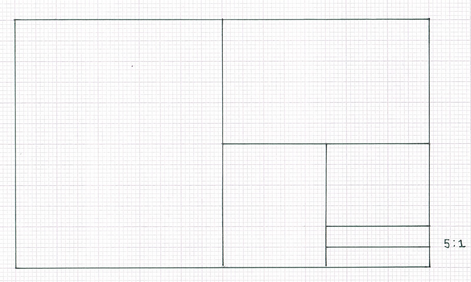
From my research I liked landscape formats the best so I am going to use the ratio of 5:1 for my page size.
Paper Dimensions- Height: 120mm
Width: 200mm
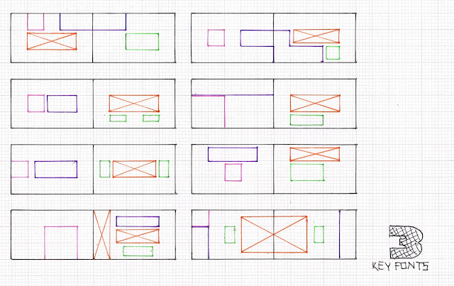
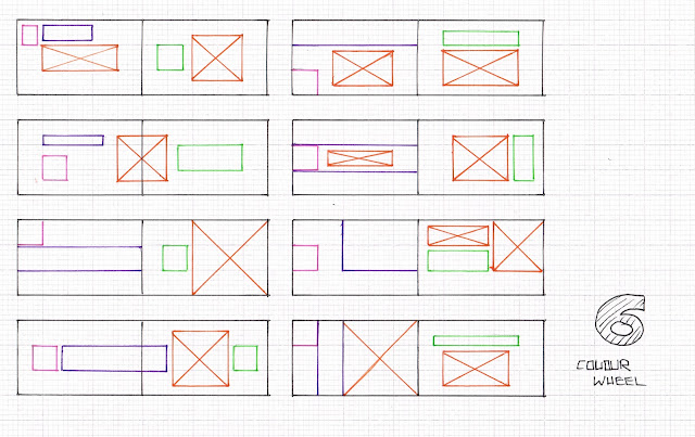
Thumbnails


Margins


I decided to use the dimensions above for my pages. The 12mm compensates for the spine and the 10mm on the bottom and outside margins allows for the pages to be held without affecting the content too much.
Margins-
Top: 6mm
Bottom: 10mm
Inside: 12mm
Outside: 10mm
Paper Dimensions- Height: 120mm
Width: 200mm
Thumbnails


I decided to use the dimensions above for my pages. The 12mm compensates for the spine and the 10mm on the bottom and outside margins allows for the pages to be held without affecting the content too much.
Margins-
Top: 6mm
Bottom: 10mm
Inside: 12mm
Outside: 10mm

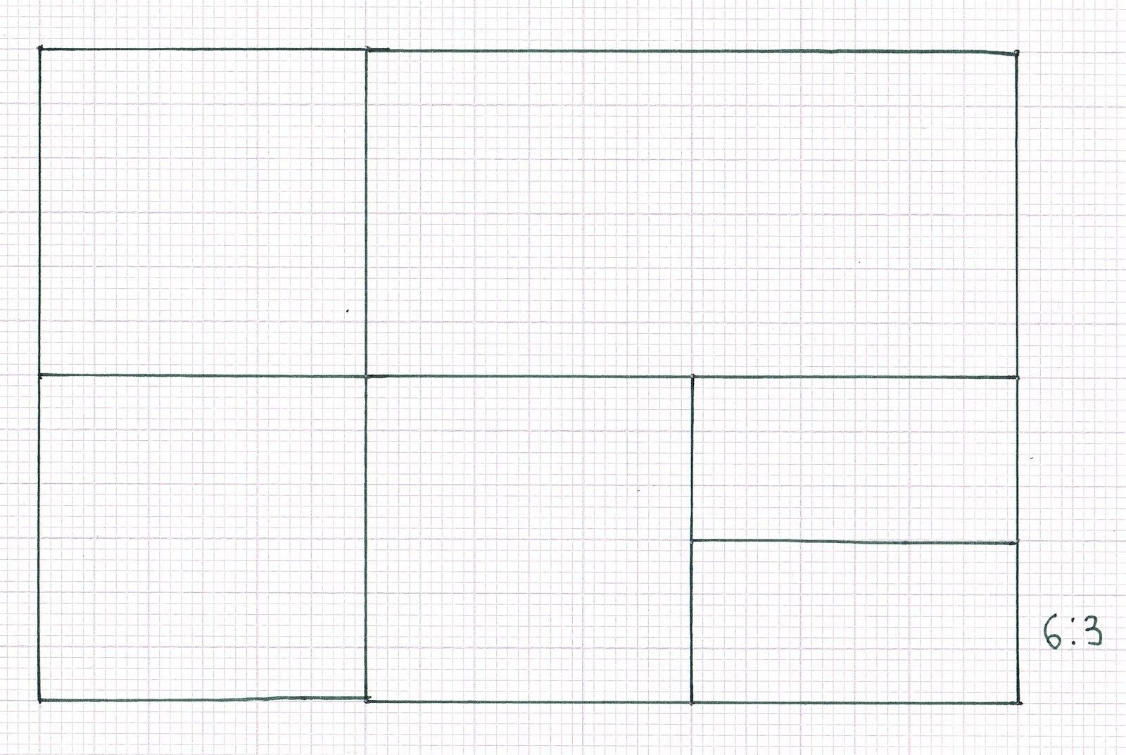
I have decided to use an 8 field grid because I think its relevant to the page size. This will give me 42 possible solutions when I come to layout the content.
Fonts
I chose three fonts to use across my double page spreads.
They were sourced them from Dafont.
Monotone
I used this font for the body copy.
I used this font for the body copy.

I used this font for the headings and sub headings.

Heavy Dock11
I mainly used this font for the pagination.

Digital Layouts
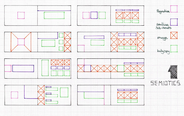
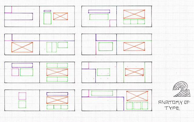
I wanted to experiment with different layouts to utilise the grid so I created a different one for each double spread. I created all of the info-graphics and images in illustrator so I could rescale them in Indesign to allow for more control to work with the grid. I tried to stick to the thumbnails I drew first but I found it hard as the content naturally evolved so I took elements form each thumbnail and combined them to create my layouts.

This spread is the front and back cover. I used type as image to represent a bullet to signify the contents ( a quick guide to graphic design)

On the left hand page I used a 4 column grid to lead the eye across the page to the information on the right hand page.


Because there is a lot going on on the right page I wanted to keep it simple on the left page. I used two columns and aligned the info on the right page to horizontally sit in the centre for a balanced layout.

I wanted this spread to be more free flowing so I had to break the grid in places to utilise the space.

For this spread I used a two column grid and asymmetrical layout.

For this spread I wanted to guide the eye from top left to bottom right. I did this with the blocks of negative space combined with the positioning of the text, staggered across the page.

For this spread I had to experiment with the the point size and tracking to get the body copy to sit on each guide. I had to make the text smaller on the right page for it to fit nicely with in the grid.

For this spread I used two columns for the right page but kept the three sections inline with the pagination and heading on the left page.

I used a four column grid on the right page and a two column grid on the left page. I aligned the columns in this way to compensate for the weight of the body copy for each section.

For this grid I aligned the text to the very edge of the outer margins to draw focus to the centre of the spread. I used two columns on the right page which both align horizontally with the heading and caption on the left page.

This page had the most information so I broke both pages into two sections making a symmetrical layout. This helped me to layout the text and images without it looking cramped.
Physical Book


E-Book
No comments:
Post a Comment