


Thumbnails
From the research I have gathered the things that stood out to me were the oversized clock and glasses, gold teeth of Flavor Flav, the P on the cap of Chuck D, The horn section in the song, the repetition of the lyric 'Just Like Dat' and the Public Enemy logo.

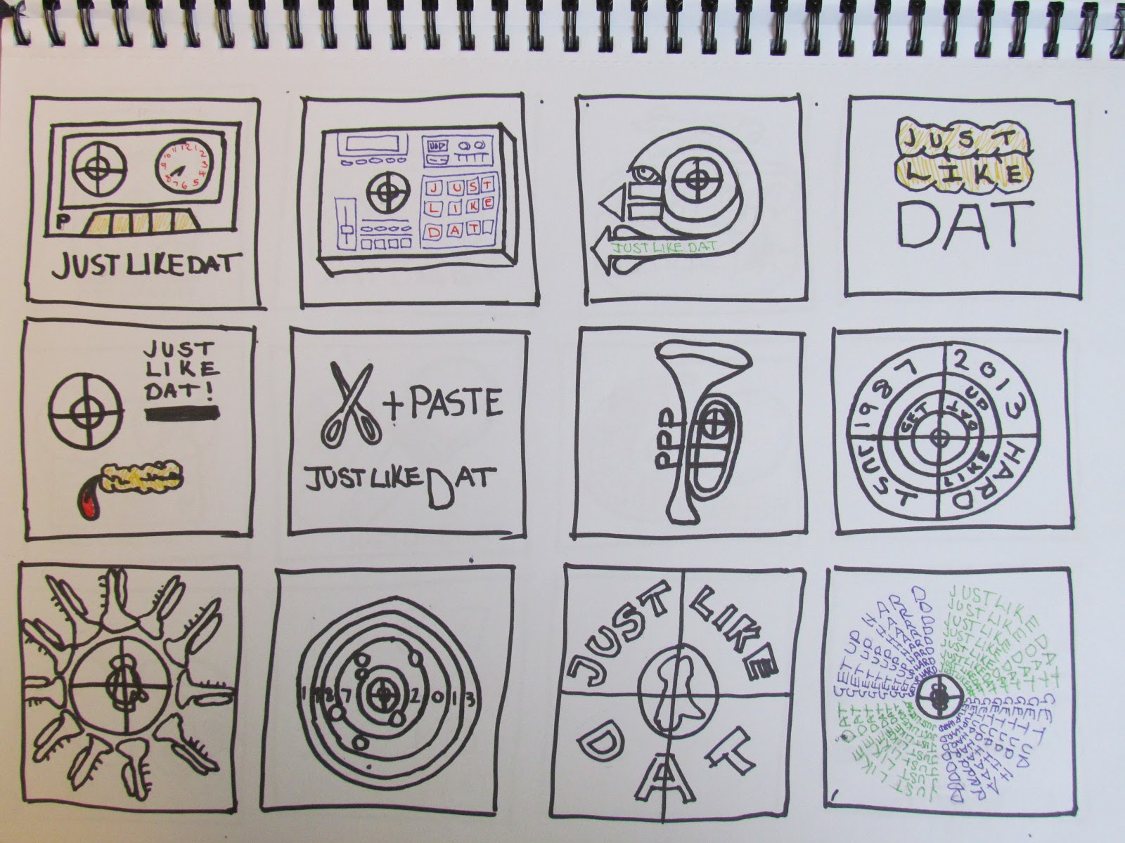
I started to focuses on the production side of the group and used musical equipment associated with Hip-hop.

The thumbnails below are the five that I am going to develop further.

I asked for some advice from Simon on my designs and he advised me that the quote from the song lyrics could be confusing and felt it didn't need it.
Vector Outlines
Next I started to map out my designs in illustrator to later add colour.


Triadic Colour Scheme
I wanted to use three colours in my designs so I experimented with the triadic colour scheme.


Brush and Reversed Colours
I tried the strokes with a hand brush because I felt it portrayed the grittiness of Hip-hop and the band much better. I kept the same colours but reversed them to see if they worked better.


I prefer the colours reversed on the two designs above. However, the three above don't work as well as the previous ones.


Final 5 Variations
These are my five final variations for the college brief. After the group crit it was suggested that the image below was the strongest of the five. The main suggestion I received was to remove the box around the P. This was my favourite image so I decided to use it for the competition.


Secret-7 Entry
The only adjustments I made to the design was removing the box around the P and I made the hands on the clock thicker. Overall I am pleased with the outcome.

Entry Documentation


No comments:
Post a Comment