Construction of Grids
Before you can apply a grid you need to understand the purpose its for
- Typeface
- text & illustration
- Print methods & stock
Always start with small sketches- Thumbnails- Sizes should be appropriate
Before drawing thumbnails, consider how many columns there are
One column only for text and illustration gives little freedom- restricts size of illustrations
Should use two columns ideally- 1 for text- one for image- can mix together
Three columns can be subdivided into a 6 column arrangement
Disadvantages of a 6 column grid:
- Lines of text will be narrow
- A small typeface will have to be used
But ...
This solely rests on the function that is to be performed!
For graphs, figures, stats, and trend line publications, use 4 columns per page
4 columns can be subdivided into 8, 16+
The width of a column dictates the size of the text used

The rule:
Narrower the column, smaller the typeface
Thumbnails and Development
Make a variety!
Do not really on one set of thumbnails
Enlarge a small section of thumbnails by 1:1
Compair and repeat the process until you are confident with the design
Apply type to columns

The first line must fit flush to the top limit of the column grid and the last line must stand on the bottom limit
The depth of field ascertains how many point type lines are needed
4 point type = 6 point leading / Caption text / A4 format
7 point type = 10 point leading / Header and footer text
Subheading - 2 lines
Type and picture- 8 field grid......


A4 format:
8 + 20 grid fields
8 grids are usually used for advertising materials
It can be subdivided into 16 fields
It allows various sizes of illustration to be portrayed
The grid is only an instrument in which you as a designer can make interesting and balanced designs.
20 field grid is the best to start using - 42 possible layout options
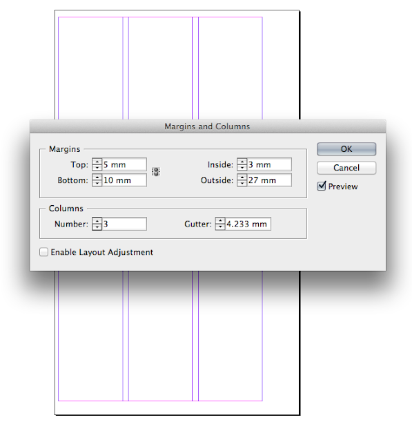
This setting allows you to create custom margins to create a more interesting page layout. For example, the distance is greater on the right to compensate for the middle of a spread.
This option allows you to create guides horizontally across the page. You can do this manually how ever the dimensions will vary.
To create this grid, drag out a container box and split in into sections by pressing the the direction keys. Go to scripts and select add guides and Indesign will create guides on each anchor point.


No comments:
Post a Comment