Pantone Colour Matching System
The Pantone Color Matching System is largely a standardized color reproduction system. By standardizing the colors, different manufacturers in different locations can all refer to the Pantone system to make sure colors match without direct contact with one another.
Pantone contains everything you need to select, specify and match solid and process colours for accurate solid colour specifying and matching
Pantone Swatches

Solid Color FORMULA GUIDES:
One flat colour
- FORMULA GUIDE Solid Coated
- FORMULA GUIDE Solid Uncoated
COLOR BRIDGE Guides:
To determine how a PANTONE Color will appear when reproduced in CMYK or to create optimal display of PANTONE Colors on monitors and Web pages
- COLOR BRIDGE Coated
- COLOR BRIDGE Uncoated
- COLOR BRIDGE® Supplement Coated
- COLOR BRIDGE® Supplement Uncoated
CMYK Guides:
Four colour process (cyan, magenta, yellow, black)
- CMYK Coated
- CMYK Uncoated
PANTONE METALLICS Guide
- METALLICS Coated
- PREMIUM METALLICS Coated
PASTELS & NEONS guide
- PASTELS & NEONS Coated & Uncoated
2.
Colour Modes
Available color systems are dependent on the medium with which a designer is working. When painting, an artist has a variety of paints to choose from, and mixed colors are achieved through the subtractive color method. When a designer is utilizing the computer to generate digital media, colors are achieved with the additive color method.
SUBTRACTIVE COLOR.
When we mix colors using paint, or through the printing process, we are using the subtractive color method. Subtractive color mixing means that one begins with white and ends with black; as one adds color, the result gets darker and tends to black.

The CMYK color system is the color system used for printing.

All desktop and professional printers mix four different ink colors — (C)yan, (M)agenta, (Y)ellow and (K)ey (Black) which is abbreviated as CMYK. These four colors can be mixed together in varying amounts and produce thousands of different shades and hues on paper.
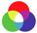
The RGB colors are light primaries and colors are created with light.
ADDITIVE COLOR.
If we are working on a computer, the colors we see on the screen are created with light using the additive color method. Additive color mixing begins with black and ends with white; as more color is added, the result is lighter and tends to white.
The RGB colors are light primaries and colors are created with light.

You should always design in RGB color mode if your final artwork is going to be used on computer screens or digital devices.
RGB can give you very bright and nice colours that are impossible to produce using inks. If you forget about this, you might end up with a great online design that looks quite dull when printed.
3.
Anatomy of Type


The letters, numbers, and symbols that make up a design of type. A typeface is often part of a type family of coordinated designs. The individual typefaces are named after the family and are also specified with a designation, such as italic, bold or condensed

One weight, width, and style of a typeface. Before scalable type, there was little distinction between the terms font, face, and family. Font and face still tend to be used interchangeably, although the term face is usually more correct.
A good rule when working with type is to use a maximum of three fonts.

7.

Character components
Typographic characters have basic component parts. The easiest way to differentiate characteristics of type designs is by comparing the structure of these components. The following terms identify some of the components of letterforms.
Terminology
AscenderThe lowercase character stroke which extends above the x-height.
BarThe horizontal stroke on the characters ‘A’, ‘H’, ‘T’, ‘e’, ‘f’, ‘t’.
BaselineThe imaginary horizontal line to which the body, or main component, of characters are aligned.
BowlThe curved stroke which surrounds a counter.
Counter
The empty space inside the body stroke.
The empty space inside the body stroke.
Descender.The lowercase character stroke which extends below the baseline.
Loop The bottom part of the lowercase roman ‘g’.
Sans serifFrom the French, meaning “without serif”. A typeface which has no serifs.Sans serif typefaces are typically uniform in stroke width.
SerifTapered corners on the ends of the main stroke. Serifs originated with the chiseled guides made by ancient stonecutters as they lettered monuments. Some serif designs may also be traced back to characteristics of hand calligraphy. Note that serif type is typically thick and thin in stroke weight.
Shoulder
The part of a curved stroke coming from the stem.
The part of a curved stroke coming from the stem.
StemA stroke which is vertical or diagonal.
TerminalThe end of a stroke which does not terminate in a serif.
X-heightThe height of the body, minus ascenders and descenders, which is equal to the height of the lowercase ‘x’.
4.

Key Fonts

Block- fonts should be used for display headers
Gothic- fonts are sans-serif and are Simply in form
Roman- fonts are standard serif fonts
Script- fonts are brush, handwritten or are made to resemble these characteristics
5.

Typeface

Font
6.
A good rule when working with type is to use a maximum of three fonts.

7.
Semiotics
Semiotics is an investigation into how meaning is created and how meaning is communicated. Its origins lie in the academic study of how signs and symbols (visual and linguistic) create meaning.
Definitions of semiotic terms
Sign: Any motion, gesture, image, sound, pattern, or event that conveys meaning.
Symbol: A person, place, action, word, or thing that (by association, resemblance, or convention) represents something other than itself.
Signifier: A linguistic unit or pattern, such as a succession of speech sounds, written symbols, or gestures, that conveys meaning; a linguistic sign.
8.
Colour Wheel

Colour Wheel

Primary Colors: Red, yellow and blue
In traditional color theory (used in paint and pigments), primary colors are the 3 pigment colors that can not be mixed or formed by any combination of other colors. All other colors are derived from these 3 hues.
In traditional color theory (used in paint and pigments), primary colors are the 3 pigment colors that can not be mixed or formed by any combination of other colors. All other colors are derived from these 3 hues.
Secondary Colors: Green, orange and purple
These are the colors formed by mixing the primary colors.
Tertiary Colors: Yellow-orange, red-orange, red-purple, blue-purple, blue-green & yellow-green
These are the colors formed by mixing a primary and a secondary color. That's why the hue is a two word name, such as blue-green, red-violet, and yellow-orange.

9.
Complimentary Colours

Complimentary colours are any two hues positioned exactly opposite each other on the colour wheel.

With this in mind, complementary colours are best to avoid using together, particularly when using type as it strains the eye and affects legibility.
10.


No comments:
Post a Comment