
Product and Packaging

The theme I researched in the previous task was the Bauhaus. I focussed my research on Bauhaus, International style architecture. For this brief I am going to design packaging for a Bauhaus architecture book thats based on the forms of Bauhaus buildings.
Product

This is the book I am going to design my packaging for.
Content
This is what is on the back of the book. I may include some of the information on my packaging to inform the audience of the content.

This is an extract from the book defining the characteristics of Modernist, Bauhaus architecture. I could compile a list of characteristics to use this for the info-graphic elements.


From my research and in keeping with the minimal modernist theme, I felt it was best to design a poster to display the information on for maximum impact on the packaging.
I decided to create a 2 Dimensional poster that can be folded up to fit into the packaging efficiently.

Poster Layouts

I like the design with the vertical text the best. Because it will be folded into strips, it will be the most effective way of displaying the information.
I based my design on the image below. This is the idea that I am going to develop.


Net Mockup
I created a mini version of the net from graph paper so I could see how it would work. I needed to design the inner net that consists of two compartments for the book and the poster. This would then slide into the outer net.


Left- Inner net
Right- Outer net
Net Dimensions
Next I drew the nets to scale to make it easier when I came to digitising them.
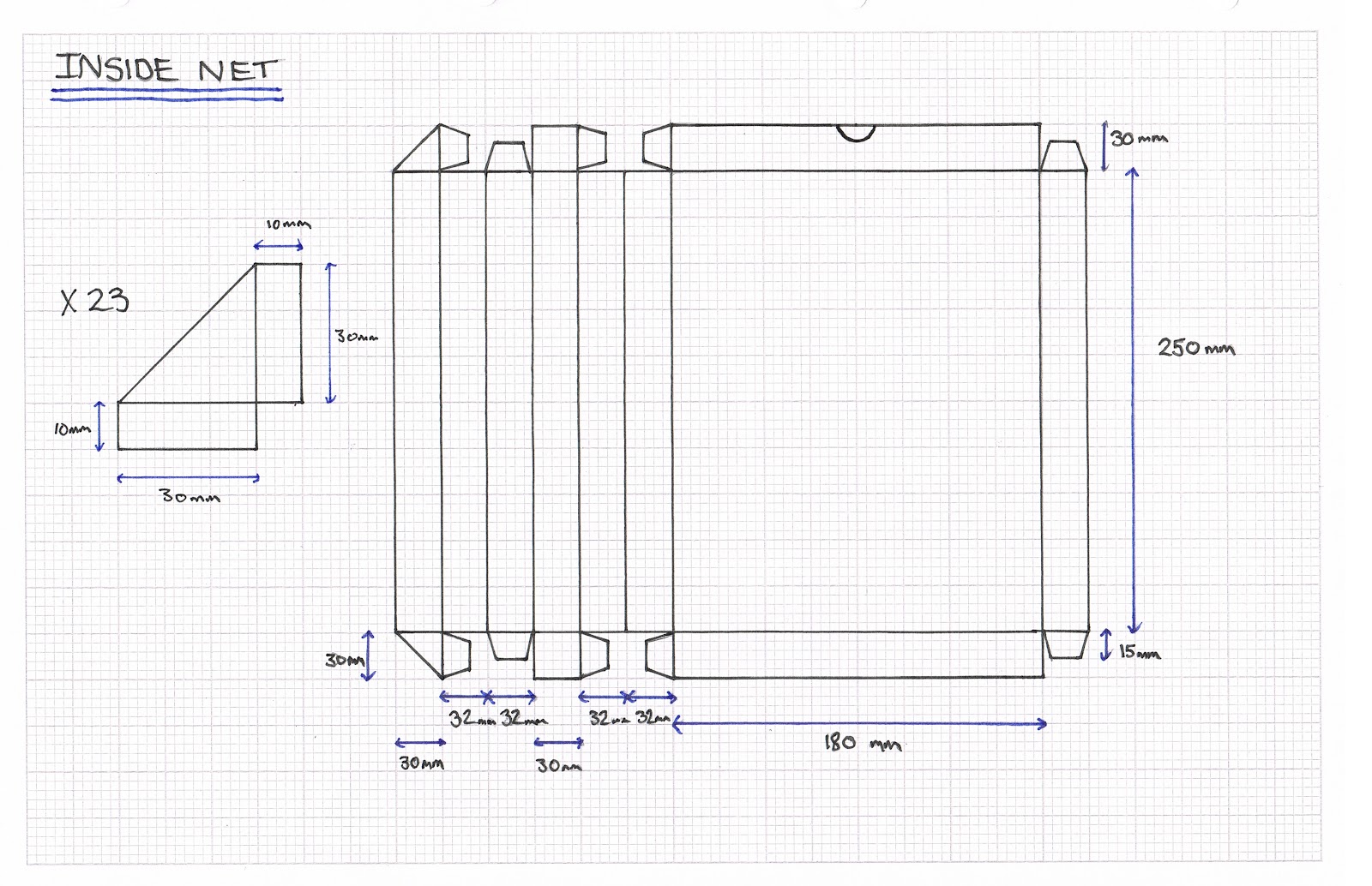

Inside Net

I made the nets on Illustrator with the shape tool by inputting the measurements I had worked out earlier. This should make construction simple.
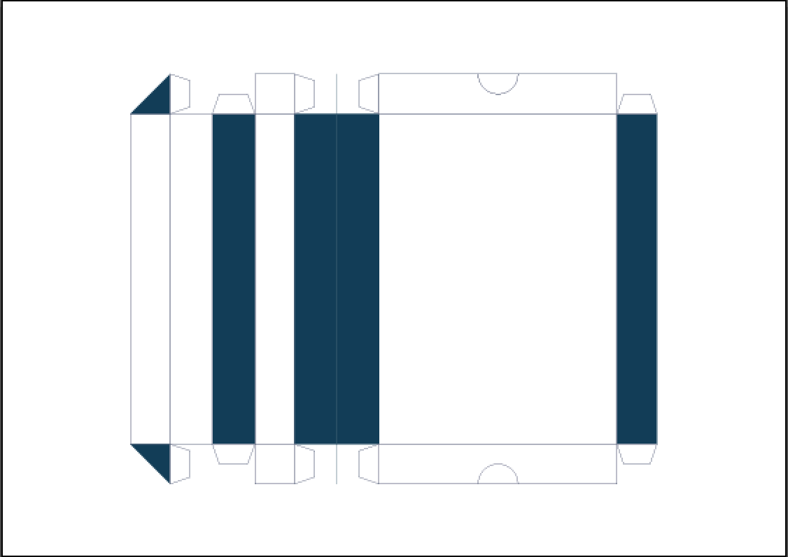
I decided to replicate the colours of the book cover to keep continuity across the packaging. As I have based my designs on the buildings in Tel Aviv, white will be the dominant colour. I think the contrast between the two works well to portray the clinical aesthetic I am looking to achieve.

I created these shapes in the same way then used the additive graphic style to make 30 replicas. These will reflect the characteristics from the building I took inspiration from.
Outside Net

Because the outer packaging is really minimal I decided to add to trade mark triangle, circle, square of the Bauhaus to inform the audience of the content but still keeping them intrigued to what is inside. I made the decision to leave any details of the book off the outer packaging to entice the audience into exploring its contents.

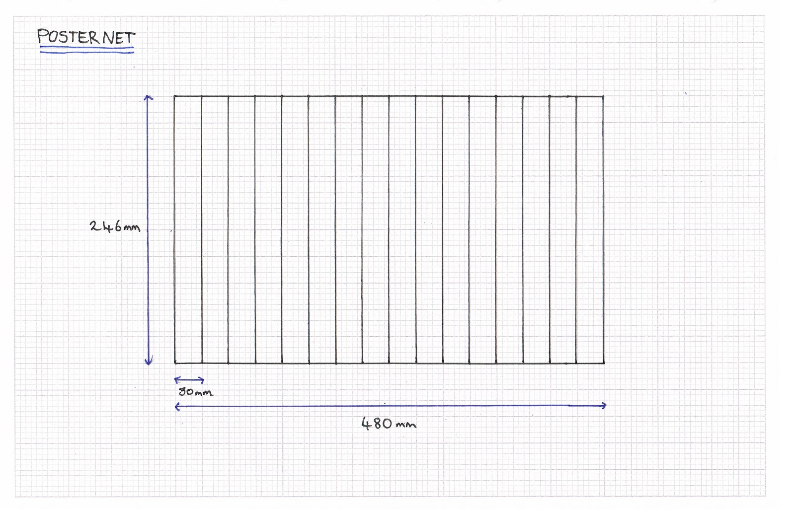
Poster Net


In keeping with the theme I used Helvetica Bold and Regular fonts for the typography. I used two colours in reverse on each section to make it clear and legible.

Because of the amount of letters in 'architecture' I had to set the tracking to -100 to allow it to fit.

I created 6 main characteristics of the bauhaus and the architecture. I didn't want to over load the page with text as I felt it was unnecessary and out of context to the overall concept.

Finally I added the Bauhaus trademark Triangle, circle, square to coincide with the front of the packaging.
Final Designs
Packaging


2 Dimensional Poster


The feedback I received from the final crit was a lot more negative than positive which was disappointing. I was told that my concept and production quality was strong, however they felt it didn't fulfil the brief as well as it could of. The main negative issues that were stated were the use of white stock, lack of information on the packaging and minimal use of info graphics.
I have revisited the designs and made some alternative layouts with some more information on the front of the packaging which was one of the main issues raised in the final crit.


I still think my original design is more appropriate to the overall concept. It think it looks over crowed and lacks impact. After a few days to reflect I agree with the comment about too much white stock. I think I could of improved it by printing onto an off white stock to calm down the brightness.
No comments:
Post a Comment