Task
The Process - Use the individual anatomical elements of your chosen fonts (Gothic, Roman, Block, Script) to create a range of possible new letterforms.
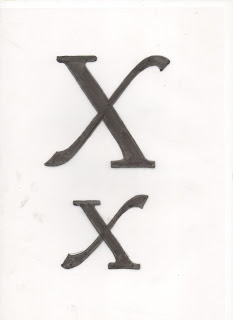
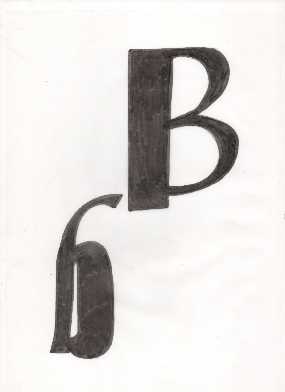
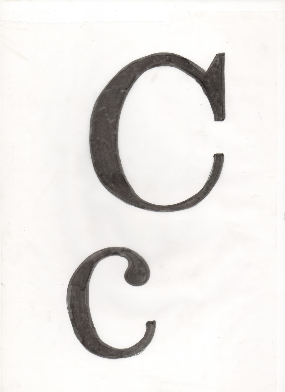
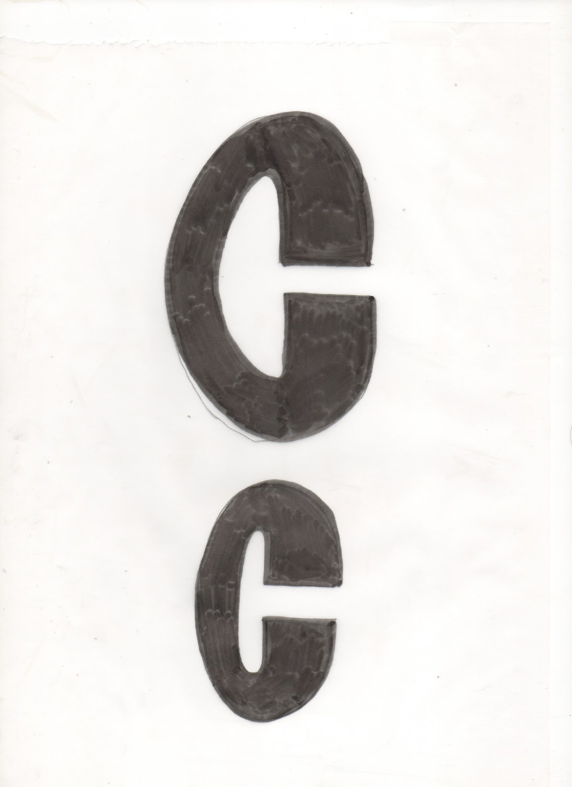
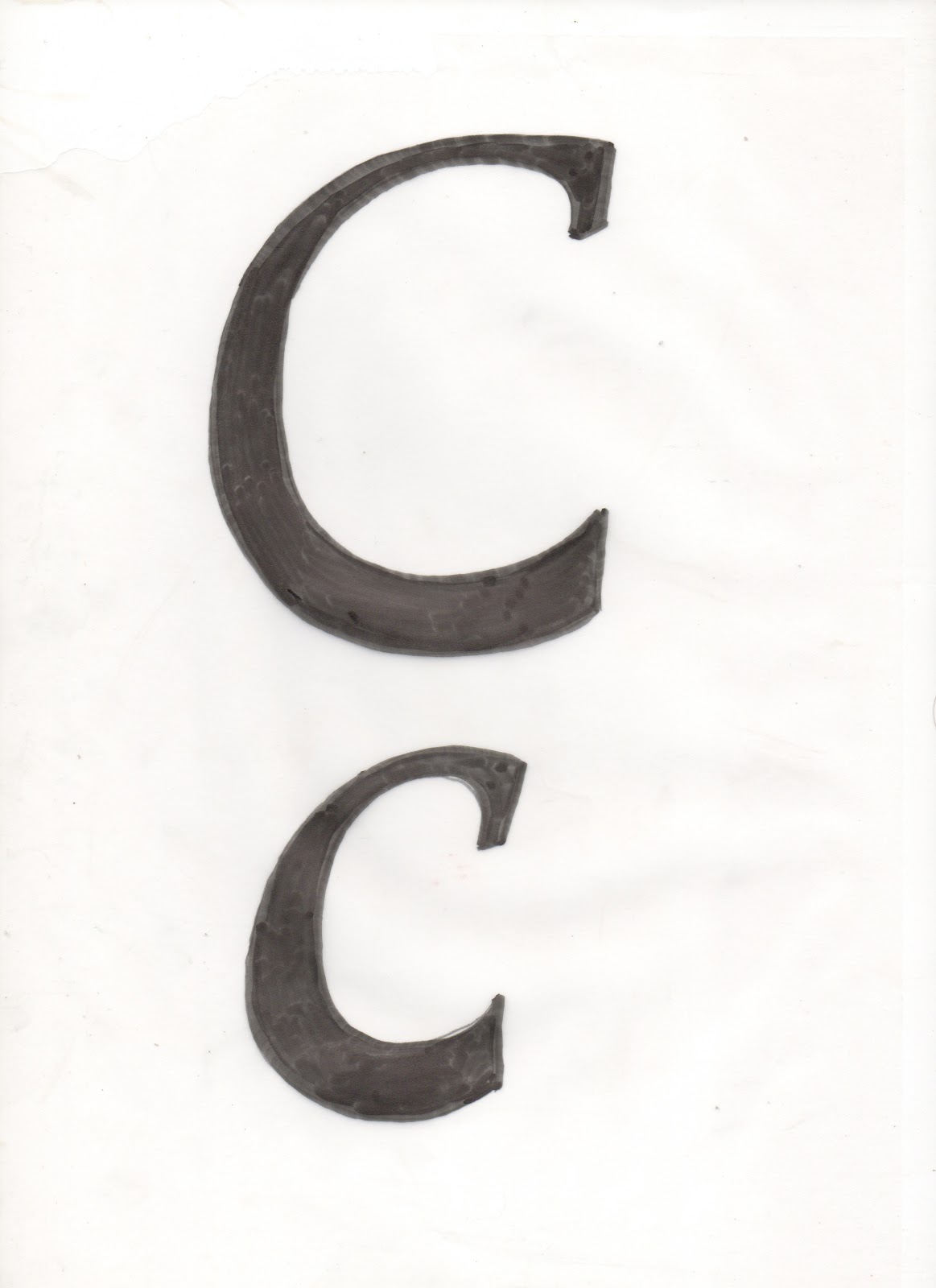
Starting letterforms

I cut out the letterforms and laid them out so I could work in a systematic way.

I separated each letter into the anatomical elements ready for practical investigation.
Practical Investigations
I have included the most successful letterforms as i found the majority to be unusable. However, working in a systematic way allows you to create a large body of work to choose from with out wasting time.
Hybrid letterforms
I chose the five most successful letterforms and developed them further creating upper/lowercase
a, b, c, x, y and z.
1. ANTONYMS Thick
Here i have combined Block and Script to create a chunky style font.


This is a combination of Roman and Script. I think this worked well to create a subtle but elegant font. This experiment has the best continuity and looks like a proper typeface.


3. Maladroit
This is a combination of Gothic and Block. I think this is the least successful out of the five. It looks clumsy and disjointed, they were the least compatible fonts once together.


Here I experimented with elements from all the groups (Roman, Gothic, Script, Block).


1. ANTONYMS Thick

Hand rendered letterforms


2. Urbanity
This is a combination of Roman and Script. I think this worked well to create a subtle but elegant font. This experiment has the best continuity and looks like a proper typeface.

Hand rendered letterforms


3. Maladroit
This is a combination of Gothic and Block. I think this is the least successful out of the five. It looks clumsy and disjointed, they were the least compatible fonts once together.

Hand rendered letterforms


4. Scriptura
I created this by combining Gothic and Script.

Hand rendered letterforms


5. New Breed
Here I experimented with elements from all the groups (Roman, Gothic, Script, Block).

Hand rendered letterforms


No comments:
Post a Comment