The letterforms I have chose to develop are
- R
- P
- B
- W
- H
- E
- K
- A
- G
- N

I started off by printing the seven weights of each letterform in the font family to experiment with.
Development


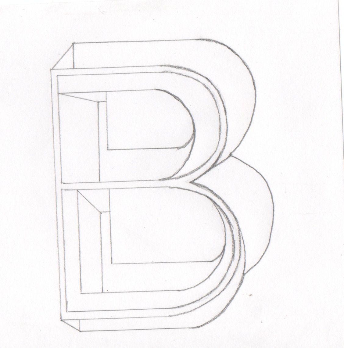
With these two designs I layered up the counters of each weight size. I prefer the left image because it creates more depth. Some shading round the edges could improve this.

I experimented with building up shapes inside the body of the letterform. Keeping in mind they have to be produced by hand, I don't like this design because I found it hard to keep my hand steady to get a clean finish.

Here I have combined the two densest weight forms with three of the letterforms counters. It creates a nice illusion of depth drawing the eye towards the centre.

I created this by tracing the letterform then moving it to the right. It creates an almost mirrored effect. The only problem with this is it could be hard to replicate with different letterforms that aren't so symmetrical.

Here I have combined the two densest weights. I cut the ares between the cross bar and folded them back over each other. I think this style looks quite unusual but I'm not too certain it communicates the word effectively enough.

I created this by tracing round the seven weights of the font. I think it works well but may be a little too obvious.

I broke the letterform down into sections. I used lines in different directions to try and represent the different layers.

I stuck the letterform onto graph paper and built up sections around it. Similar to above I used lines to represent the different sections.

For this design I have used textures from the inside of various envelopes and cut them into segments that construct the letterform. After some more thought, I don't think this style is appropriate considering the finals have to be hand drawn and black and white.


I dont think these two designs are very successful. The left is two minimal and doesn't communicate layer the best. I created the right by cutting two of the same letterforms into diagonal strips and weaving together. I like the idea, just not happy with the craft.
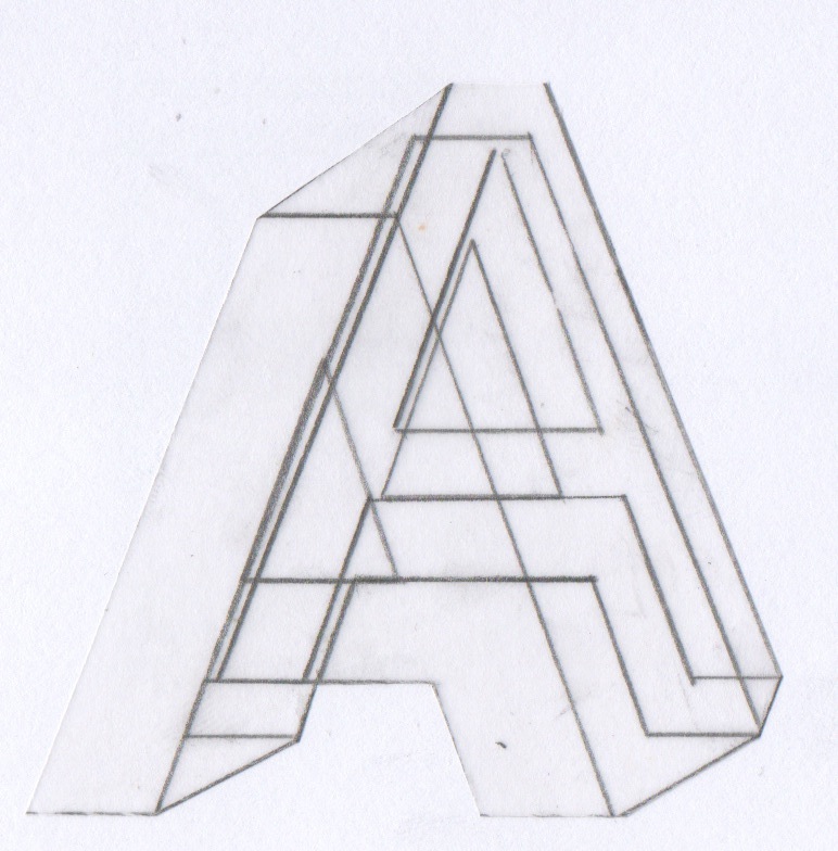

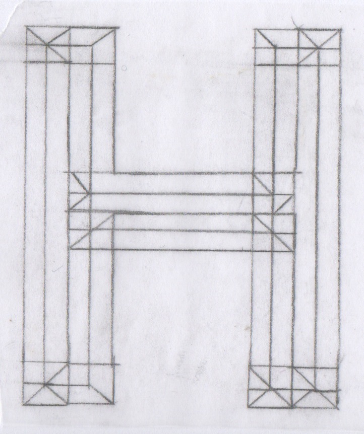
Here i was experimenting with perspective to add 3Dimensional aspects to the letterforms. I think this style works well to help visualise the layers in a more interesting way.

This is my favourite design so far. I created it by tracing round the thinest weight size first, then tracing round different elements, from the different weights, slightly off centred to create a sense of depth. I connected the corners to create a disjointed, warped perspective. I think this works well to deceive the eye into thinking the letterforms are built up of various layers on different levels. I have decided to develop the other nine letterforms in this style so they work as a set.
10 Letterforms

This is my first rough draft of my letterforms. I am pleased with how they have turned out. I now need to scan them and rescale to size, then re-trace and adjust any sections that need refining.
Refined Finals


These are my ten refined finals displayed on 10x10 ready for the group crit. I think they work well as a set and I am pleased with the outcome.
No comments:
Post a Comment