
I am required to design a typeface for a full alphabet and glyphs that represent the personality/character of my partner.
The partner I received is Danielle Muntyan.
We got into our pairs and filled out a simple questionnaire about each other.

I didn't find these questions very helpful in understanding her personality so we had a further discussion about each others interests, character and traits.


I found this image on Danielle's Facebook profile. I think it must of been a similar activity she did at previous education.
I have highlighted the main points of her personality to give me a starting point to conduct my research.
Character
- Loud
- Opinionated
- Friendly
- Organised chaos
- Spanish/Italian/Hungarian/Ukrainian heritage
- Sociable
- Confident
- Feminine
- Glamorous

The font I chose to manipulate is nouvelle vague. I have chosen this font because it combines bold with thin stokes which I think represents Danielle's personality really well. She's a small person with a big, bold personality thats complimented with a feminine touch.
- Cake decorating
- Baking
- Tattoos
- Piercings
- Digital collage- Dawn Gardener
- Patterns
- Textures
- Fashion
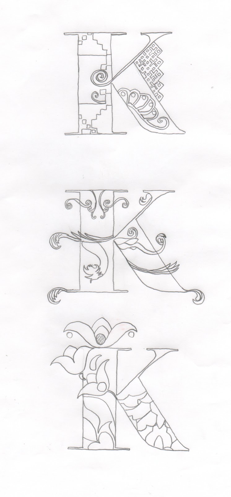
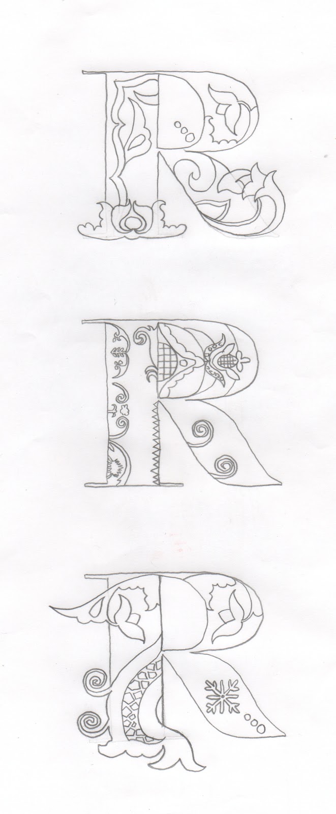
To start off I have arranged the alphabet to scale so I can start to experiment with different designs.

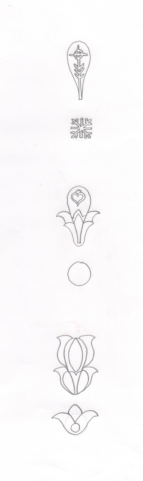
I have selected some of the patterns from my research and arranged them onto sheets to start tracing from.

Visual Investigation


Final Design

Name Badge

Because of the size of the name badge I had to descale my letterforms which made the detail hard to see. However the legibility/readability was good so it wasn't a complete disaster.

To finish this brief off I had to choose a product that I think my typeface would fit. I chose Pandora because I think the decoration of my font works well with the products portraying delicate and intricate jewellery.
No comments:
Post a Comment